Are we focusing on the right Accounts and Opportunities?
A common question in sales departments. Accounts are often classified in some kind of A, B, C categorization based on their potential value etc. Ideally, that means you sales activity should primarily be related to A accounts and some B accounts. However, a common setup in CRM, is to set your sales activities regarding an Opportunity.
So if I want to see if sales activities are focused on the right type of Accounts, I need a chart that show me all the Activities related to an Opportunity, but group the data by the A, B, C categorization on the Account. Something that is not possible in the MS CRM Chart Designer.
The tricky part here is that we now have two steps.
Activity -> Opportunity -> Account
Had we only had one step, it would have been fairly easy to do everything in the MS Dynamics CRM Chart Designer. For example, if you wanted an overview of your Est. Revenue in Opportunities based on the type of Account, all you need to do is add the field from the Account entity, to your Opportunities View in “Advanced Find”, save the View, and then use it when you open the chart editor. Thank you to Adam Vero for having brought that very helpful shortcut to my attention.
Since our scenario has two steps, we can’t use this trick. However, we can get Advanced Find to do the most of the dirty work.
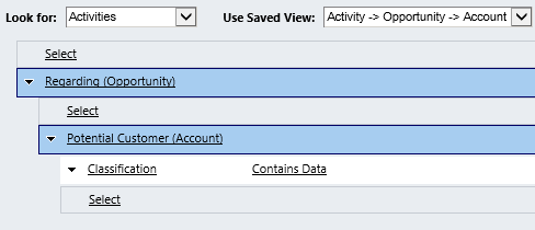
In Advanced Find, from the Activities entity, create a filter that goes to the Regarding (Opportunity), to the Potential Customer (Account) and check if the desired field, Classification, contains data.
Save the View and download the FetchXML for later as it contains the needed link information in xml format.
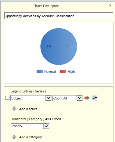
Next I’ll create a chart in the chart editor that I can use as a base for my new chart xml. I want my final chart to be a pie chart grouped by the Account classification. Since I need to add that link in the chart xml, I’ll create a similar chart and use another field as a placeholder.
In this case the field “Priority” is the placeholder for the A, B, C classification.
I’ll export this chart and now I’ve got the pieces I need.
First I’ll take what I need from the FetchXML I downloaded from Advanced Find..
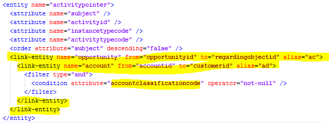
Highlighted are the needed lines with the <link-entity> information from Activity -> Opportunity -> Account, as well as the schema name for the Classification field, which we want to group by. We do not want to keep the filter information in this case.
Now that I have the link information, I’ll open the Chart XML and locate the groupby attribute line in the fetchcollection part.
I want the <link-entity> tags from the FetchXML to surround this groupby attribute line. Then the placeholder, the prioritycode, should be replaced with the “accountclassificationcode” from the Account entity.
Final version should look like this.
Import it back into CRM and use it on a View that only show Activities related to an Opportunity.

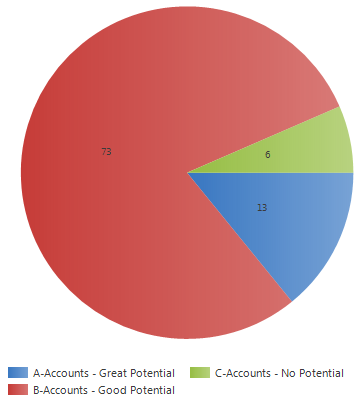
Hopefully that’ll get you a little closer to knowing if your Sales/Opportunity time is spent on Accounts that are worth it. In this case, more time is spent on B-Accounts than A-Accounts.
So, how many nested <link-entities> can CRM handle? Well, you can go at least 4 entities out. Beyond that, and probably sooner, you’ll hit a point there the chart just doesn’t make sense any longer.
Depending on the volume of records, this is an area where you can tell that these charts load a little slower. Only a few extra seconds, so enough to be noticeable, but it shouldn’t impact usability.
Thanks for reading and please follow me on Twitter Follow @crmchartguy


Wendell again, I’m still onmy quest for a Gantt schedule chart, and your suggestion about the rangebar put em on the right path. I had to substitute integers (YYMMDD) for dates to get anything to work. Now I’m trying to color-code the bars by type (the brand on promotion in my case) by creating two series of bars, one for brand “0” and another for Brand “1”. My problem is the Fetchxml below. If I set the two filters to the same value (same brand), all four data columns (_fdate, _ldate, _fdate2, _ldate2) are returned correctly. When I make the brand filter values different (…0 and …1) only one set of values is returned (_fdate2 _ldate2).
Any ideas on what’s going on here?
Hi Wendell.
It might be the link-entities or aggregates that’s causing some issues. Feel free to email me the xml and I’ll have a look. I’m curious now 🙂
Email is ubc (at) alfapeople (dot) com
Excellent post, a huge help.
I’m looking to group on a values in a pick list.. ie project type A, project type b, project type c and project type d. Project type A, B and D = “customer facing projects”, Project = “not customer facing”.
How would I go about grouping records on a VALUE of my choosing? In my case, values in a picklist.
sorry the second grouping would be Porject C – “not customer facing”
Hi Todd – Have a look at this post. https://crmchartguy.wordpress.com/2013/03/10/aggregate-total-on-top-of-stacked-column-charts-or-bar-charts-in-ms-crm-2011/
In your case, filter on the on the option set instead. You can use Advanced Find to create the fetch filter conditions for you.
Hi,
I used this post to create an Invoice chart showing revenues (Invoice Total Amount) by users who made phone calls on the Invoiced accounts. It looked like it worked, but upon further review, it is multiplying the Total Amount by the number of phone calls.
For example, a user made 4 phone calls on a certain account. This account has 1 invoice for $2,000. The chart is showing a total amount for this user of $8,000, when it should still only show $2,000.
Any ideas on where I went wrong or how I can fix this?
Thank you,
Brianna
As usual – a very helpful post!
Keep them coming 🙂
Hi there, thank you kindly for sharing your knowledge. I have a question around this chart and the ability to drill down into the information it displays. Usually for charts I can drill down into a chart section by clicking on that section (i.e. sales for oct 2016 in a chart displaying the year to date data) and the adv find/related data view updates its displayed information to display what selection I have made on the chart. I can’t seam to drill down into the information provided on this chart like I can with other charts. Is that because we are using a related entity of a related entity?? or something else?