Adding an aggregated total to the top of a stacked column chart sounds simple enough. It’s a couple of clicks in Excel. In MS CRM 2011 however, it is a different story. You would have to add an additional series to the chart, which then calculates and displays the total. But Stacked Column charts in MS CRM 2011 do not support multiple series.
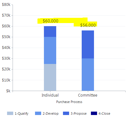
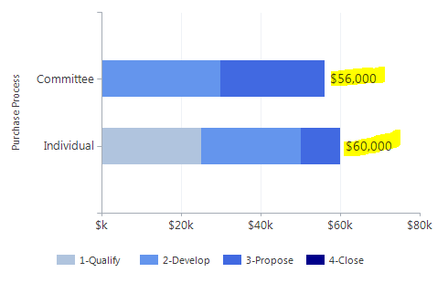
But that does not mean it is not possible. This CRM chart show us the aggregated total value of each of our pipelines, stacked by the pipeline phases, for each of the types of purchase processes.
So how did I create this chart? First, I need a chart with a series for each of the 4 pipeline stages, and one for the total. Then I display the series in the chart so they look like a standard stacked column chart. The total on top is a point chart type. The drawback here, is of course that all the possible series needs to be known so we can include them in the chart. In this case, all the series are each phase in the pipeline.
Since the user interface in MS CRM 2011 for creating charts does not support multiple series for stacked column charts, we need to create something else as our chart XML base and work off that.
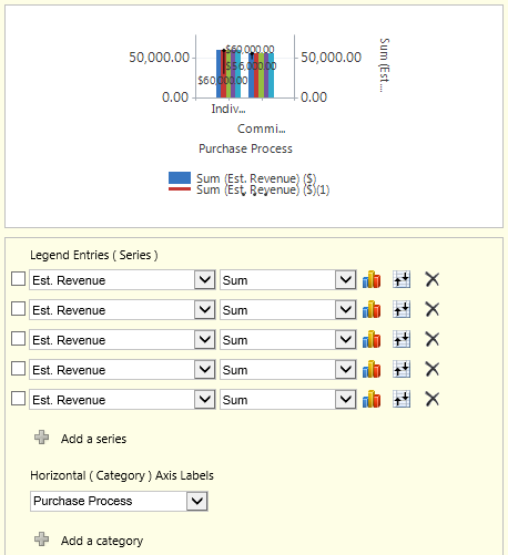
I will use the UI to create a normal column chart and add all the series I need.
In this case a column chart with 5 series.
1 for each of the 4 stages in the pipeline (Develop, Qualify, Propose, Close) plus 1 extra series for the total.
I want to see how my pipelines looks between the different types of Purchases Processes, so I’ll pick “Purchase Process” as the category so I get that on the X axis.
All the series I have added as a standard column chart.
Now I’ll export the chart xml and get to work. (Full chart XML samples are available at the bottom of this post)
CRM 2011 might add some references to a secondary Y axis in your XML. If that is the case, remove these first.
Rename the series in the Chart XML
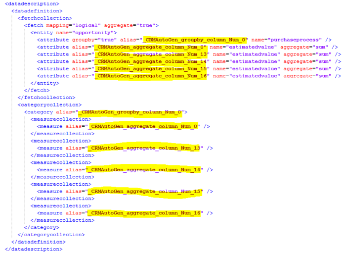
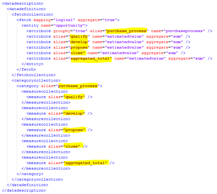
I’ll start out by renaming all the aliases to something more sensible and easier to work with.
Original XML
Chart XML with renamed aliases
Now it’s much easier for me to see which alias represents what data. I have “Purchase Process” as the category, the name for each pipeline phase, and the aggregated total at the end.
Change the Series Chart Types
Next I’ll change the first 4 series for the pipeline phases from ChartType=”Column” to ChartType=”StackedColumn”.
The last series for the aggregated total will need the following changes;
- ChartType=”Point”
- IsVisibleInLegend=”False” – don’t need to see “Total” in the legend
- IsValueShownAsLabel=”True” – YES, this is the whole point of this chart
- LabelFormat=”#,#,#” – no need to see decimals on the total
- MarkerColor & MarkerBorderColor=”Transparent” – we just want the total amount – no need to see a marker also
- The font I increased to 14px so it stands out more
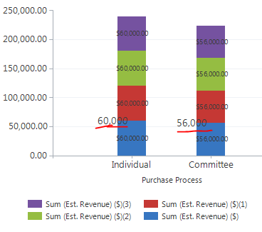
Let’s do a quick import of the chart xml just to check what it now looks like in CRM.
We can see the total amount in the larger font, but the different pipeline phases are also showing the aggregate amount.
Let’s add a filter to each of the series in the fetchcollection, so they only show the correct amount for each phase.
Filter the series for the Pipeline Phases
Here’s the original fetchcollection.
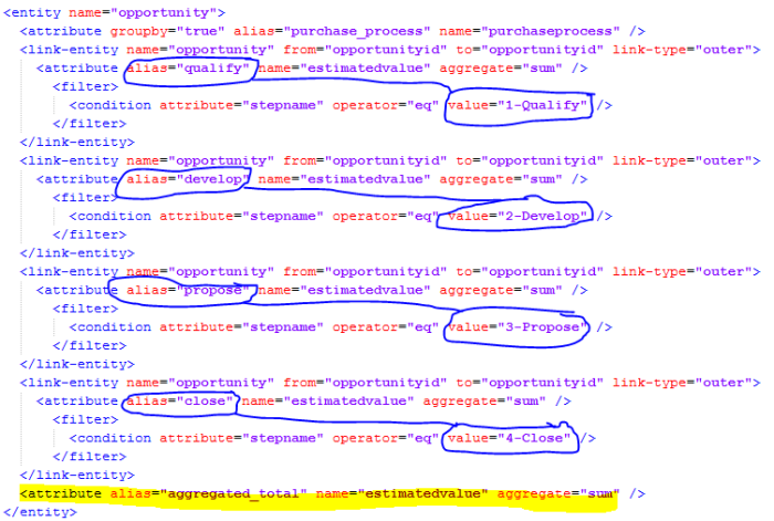
I’ll add a filter to each of the series by creating a self-referential <link-entity>. This will allow me to make sure each series only sum up the value of the Opportunities, specific to its phase. The easiest way to get the filter properties is by creating them in Advanced Find and export the FetchXML.
Each attribute will get a <link-entity> and <filter> added as follows.
<link-entity name="opportunity" from="opportunityid" to="opportunityid" link-type="outer">
  <attribute alias="qualify" name="estimatedvalue" aggregate="sum" />
    <filter>
      <condition attribute="stepname" operator="eq" value="1-Qualify" />
    </filter>
</link-entity>
Here’s a part of the fetchcollection with filters added for each attribute for the pipeline phases. The last attribute I’ll leave without a filter as we do want the total on that one.
Time to import the XML and have a look.
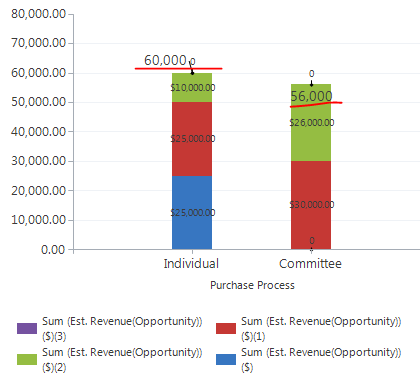
Chart is now filtered and stacked properly for each series and there’s an aggregated total on top.
Adjust Chart Axis, Legend and Colors
It works, but we can make the chart look a lot easier to read and understand.
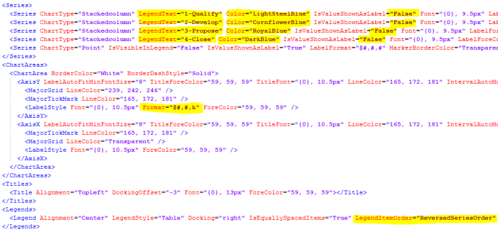
I’ll make the following changes:
- IsValueShownAsLabel=”false” on all series except the total.
- Add LegendText to all the series except the total
- Add Color to each series – I’m going with increasingly darker shades of blue in this case
- Add Format=”$#,#,k” to the LabelStyle for a shorter label on the Y axis
Last, I’ll reverse the series in the legend, because MS CRM 2011 automatically reverses it on stackedcolumn charts. In other words, I reverse the reversed order so it reads 1-2-3-4 instead of 4-3-2-1.
One final import of the CRM chart XML and here’s the result.
A couple of notes:
- Bonus: Even though no Opportunities are in phase “4-Close” we still see it in the legend
- Filtering in the XML can be tricky – it’s your job to make sure everything relevant get’s accounted for
- This approach allow you to add colors directly in the Series, which can be a lot easier than using the PaletteCustomColors
- The Series have to be listed in the exact same order in the presentationdescription as they do in the measurecollection
- The User can still hover the mouse over the chart to get the exact value of each pipeline phase in the tooltip
How about an Aggregate Total on top of a Stacked Bar Chart?
The same approach can be used for bar charts. All the chart types need to be a Stacked Bar for the pipeline phases and then a regular Bar type for the total, which then have to be made transparent. (XML sample included at the bottom of post)
Hope you enjoyed this post.
If you did, please follow me on Twitter for CRM Chart updates Follow @crmchartguy
Chart XML Samples
These chart xml samples are for reference only and not intended for use in a live environment without thorough testing.
They were created on a Microsoft Dynamics CRM 2011 trial with only the sample data added. The only addition I made to the sample data, was adding values to the Purchase Process field on the Opportunities.
Stacked Column Chart with aggregated total
<visualization>
<visualizationid>{C618533F-3784-E211-8B16-78E3B5114607}</visualizationid>
<name>Aggregated Total on top of StackColumn chart</name>
<primaryentitytypecode>opportunity</primaryentitytypecode>
<datadescription>
<datadefinition>
<fetchcollection>
<fetch mapping="logical" aggregate="true">
<entity name="opportunity">
<attribute groupby="true" alias="purchase_process" name="purchaseprocess" />
<link-entity name="opportunity" from="opportunityid" to="opportunityid" link-type="outer">
<attribute alias="qualify" name="estimatedvalue" aggregate="sum" />
<filter>
<condition attribute="stepname" operator="eq" value="1-Qualify" />
</filter>
</link-entity>
<link-entity name="opportunity" from="opportunityid" to="opportunityid" link-type="outer">
<attribute alias="develop" name="estimatedvalue" aggregate="sum" />
<filter>
<condition attribute="stepname" operator="eq" value="2-Develop" />
</filter>
</link-entity>
<link-entity name="opportunity" from="opportunityid" to="opportunityid" link-type="outer">
<attribute alias="propose" name="estimatedvalue" aggregate="sum" />
<filter>
<condition attribute="stepname" operator="eq" value="3-Propose" />
</filter>
</link-entity>
<link-entity name="opportunity" from="opportunityid" to="opportunityid" link-type="outer">
<attribute alias="close" name="estimatedvalue" aggregate="sum" />
<filter>
<condition attribute="stepname" operator="eq" value="4-Close" />
</filter>
</link-entity>
<attribute alias="aggregated_total" name="estimatedvalue" aggregate="sum" />
</entity>
</fetch>
</fetchcollection>
<categorycollection>
<category alias="purchase_process">
<measurecollection>
<measure alias="qualify" />
</measurecollection>
<measurecollection>
<measure alias="develop" />
</measurecollection>
<measurecollection>
<measure alias="propose" />
</measurecollection>
<measurecollection>
<measure alias="close" />
</measurecollection>
<measurecollection>
<measure alias="aggregated_total" />
</measurecollection>
</category>
</categorycollection>
</datadefinition>
</datadescription>
<presentationdescription>
<Chart Palette="None" PaletteCustomColors="55,118,193; 197,56,52; 149,189,66; 117,82,160; 49,171,204; 255,136,35; 97,142,206; 209,98,96; 168,203,104; 142,116,178; 93,186,215; 255,155,83">
<Series>
<Series ChartType="Stackedcolumn" LegendText="1-Qualify" Color="LightSteelBlue" IsValueShownAsLabel="False" Font="{0}, 9.5px" LabelForeColor="59, 59, 59" CustomProperties="PointWidth=0.75, MaxPixelPointWidth=40"></Series>
<Series ChartType="Stackedcolumn" LegendText="2-Develop" Color="CornflowerBlue" IsValueShownAsLabel="False" Font="{0}, 9.5px" LabelForeColor="59, 59, 59" CustomProperties="PointWidth=0.75, MaxPixelPointWidth=40"></Series>
<Series ChartType="Stackedcolumn" LegendText="3-Propose" Color="RoyalBlue" IsValueShownAsLabel="False" Font="{0}, 9.5px" LabelForeColor="59, 59, 59" CustomProperties="PointWidth=0.75, MaxPixelPointWidth=40"></Series>
<Series ChartType="Stackedcolumn" LegendText="4-Close" Color="DarkBlue" IsValueShownAsLabel="False" Font="{0}, 9.5px" LabelForeColor="59, 59, 59" CustomProperties="PointWidth=0.75, MaxPixelPointWidth=40"></Series>
<Series ChartType="Point" IsVisibleInLegend="False" IsValueShownAsLabel="True" LabelFormat="$#,#,#" MarkerBorderColor="Transparent" MarkerColor="Transparent" Font="{0}, 14px" LabelForeColor="59, 59, 59"></Series>
</Series>
<ChartAreas>
<ChartArea BorderColor="White" BorderDashStyle="Solid">
<AxisY LabelAutoFitMinFontSize="8" TitleForeColor="59, 59, 59" TitleFont="{0}, 10.5px" LineColor="165, 172, 181" IntervalAutoMode="VariableCount">
<MajorGrid LineColor="239, 242, 246" />
<MajorTickMark LineColor="165, 172, 181" />
<LabelStyle Font="{0}, 10.5px" Format="$#,#,k" ForeColor="59, 59, 59" />
</AxisY>
<AxisX LabelAutoFitMinFontSize="8" TitleForeColor="59, 59, 59" TitleFont="{0}, 10.5px" LineColor="165, 172, 181" IntervalAutoMode="VariableCount">
<MajorTickMark LineColor="165, 172, 181" />
<MajorGrid LineColor="Transparent" />
<LabelStyle Font="{0}, 10.5px" ForeColor="59, 59, 59" />
</AxisX>
</ChartArea>
</ChartAreas>
<Titles>
<Title Alignment="TopLeft" DockingOffset="-3" Font="{0}, 13px" ForeColor="59, 59, 59"></Title>
</Titles>
<Legends>
<Legend Alignment="Center" LegendStyle="Table" Docking="right" IsEquallySpacedItems="True" LegendItemOrder="ReversedSeriesOrder" Font="{0}, 11px" ShadowColor="0, 0, 0, 0" ForeColor="59, 59, 59" />
</Legends>
</Chart>
</presentationdescription>
<isdefault>false</isdefault>
</visualization>
Stacked Bar Chart with aggregated total
 <visualization>
<visualizationid>{C618533F-3784-E211-8B16-78E3B5114607}</visualizationid>
<name>Aggregated Total on top of Stackedbar Chart</name>
<primaryentitytypecode>opportunity</primaryentitytypecode>
<datadescription>
<datadefinition>
<fetchcollection>
<fetch mapping="logical" aggregate="true">
<entity name="opportunity">
<attribute groupby="true" alias="purchase_process" name="purchaseprocess" />
<link-entity name="opportunity" from="opportunityid" to="opportunityid" link-type="outer">
<attribute alias="qualify" name="estimatedvalue" aggregate="sum" />
<filter>
<condition attribute="stepname" operator="eq" value="1-Qualify" />
</filter>
</link-entity>
<link-entity name="opportunity" from="opportunityid" to="opportunityid" link-type="outer">
<attribute alias="develop" name="estimatedvalue" aggregate="sum" />
<filter>
<condition attribute="stepname" operator="eq" value="2-Develop" />
</filter>
</link-entity>
<link-entity name="opportunity" from="opportunityid" to="opportunityid" link-type="outer">
<attribute alias="propose" name="estimatedvalue" aggregate="sum" />
<filter>
<condition attribute="stepname" operator="eq" value="3-Propose" />
</filter>
</link-entity>
<link-entity name="opportunity" from="opportunityid" to="opportunityid" link-type="outer">
<attribute alias="close" name="estimatedvalue" aggregate="sum" />
<filter>
<condition attribute="stepname" operator="eq" value="4-Close" />
</filter>
</link-entity>
<attribute alias="aggregated_total" name="estimatedvalue" aggregate="sum" />
</entity>
</fetch>
</fetchcollection>
<categorycollection>
<category alias="purchase_process">
<measurecollection>
<measure alias="qualify" />
</measurecollection>
<measurecollection>
<measure alias="develop" />
</measurecollection>
<measurecollection>
<measure alias="propose" />
</measurecollection>
<measurecollection>
<measure alias="close" />
</measurecollection>
<measurecollection>
<measure alias="aggregated_total" />
</measurecollection>
</category>
</categorycollection>
</datadefinition>
</datadescription>
<presentationdescription>
<Chart Palette="None" PaletteCustomColors="55,118,193; 197,56,52; 149,189,66; 117,82,160; 49,171,204; 255,136,35; 97,142,206; 209,98,96; 168,203,104; 142,116,178; 93,186,215; 255,155,83">
<Series>
<Series ChartType="Stackedbar" LegendText="1-Qualify" Color="LightSteelBlue" IsValueShownAsLabel="False" Font="{0}, 9.5px" LabelForeColor="59, 59, 59" CustomProperties="PointWidth=0.75, MaxPixelPointWidth=40"></Series>
<Series ChartType="Stackedbar" LegendText="2-Develop" Color="CornflowerBlue" IsValueShownAsLabel="False" Font="{0}, 9.5px" LabelForeColor="59, 59, 59" CustomProperties="PointWidth=0.75, MaxPixelPointWidth=40"></Series>
<Series ChartType="Stackedbar" LegendText="3-Propose" Color="RoyalBlue" IsValueShownAsLabel="False" Font="{0}, 9.5px" LabelForeColor="59, 59, 59" CustomProperties="PointWidth=0.75, MaxPixelPointWidth=40"></Series>
<Series ChartType="Stackedbar" LegendText="4-Close" Color="DarkBlue" IsValueShownAsLabel="False" Font="{0}, 9.5px" LabelForeColor="59, 59, 59" CustomProperties="PointWidth=0.75, MaxPixelPointWidth=40"></Series>
<Series ChartType="Bar" IsVisibleInLegend="False" IsValueShownAsLabel="True" LabelFormat="$#,#,#" Color="Transparent" Font="{0}, 14px" LabelForeColor="59, 59, 59"></Series>
</Series>
<ChartAreas>
<ChartArea BorderColor="White" BorderDashStyle="Solid">
<AxisY LabelAutoFitMinFontSize="8" TitleForeColor="59, 59, 59" TitleFont="{0}, 10.5px" LineColor="165, 172, 181" IntervalAutoMode="VariableCount">
<MajorGrid LineColor="239, 242, 246" />
<MajorTickMark LineColor="165, 172, 181" />
<LabelStyle Font="{0}, 10.5px" Format="$#,#,k" ForeColor="59, 59, 59" />
</AxisY>
<AxisX LabelAutoFitMinFontSize="8" TitleForeColor="59, 59, 59" TitleFont="{0}, 10.5px" LineColor="165, 172, 181" IntervalAutoMode="VariableCount">
<MajorTickMark LineColor="165, 172, 181" />
<MajorGrid LineColor="Transparent" />
<LabelStyle Font="{0}, 10.5px" ForeColor="59, 59, 59" />
</AxisX>
</ChartArea>
</ChartAreas>
<Titles>
<Title Alignment="TopLeft" DockingOffset="-3" Font="{0}, 13px" ForeColor="59, 59, 59"></Title>
</Titles>
<Legends>
<Legend Alignment="Center" LegendStyle="Table" Docking="right" IsEquallySpacedItems="True" LegendItemOrder="ReversedSeriesOrder" Font="{0}, 11px" ShadowColor="0, 0, 0, 0" ForeColor="59, 59, 59" />
</Legends>
</Chart>
</presentationdescription>
<isdefault>false</isdefault>
</visualization>


Excellent post – I especially like how you show the interim stages so people can see how it builds up, and what each XML change does, rather than all in one “ta-daa!!” moment at the end.
Also helps troubleshoot if someone makes a change which is not right, they may be able to spot which step has gone wrong.
Interesting post. I’d like to know how one can alter the order in which the data appear within a single bar, though. At work, I’m getting a bar of the number of items in queue aggregated by day. The problem is that the oldest tickets (lower date value) are placed at the bottom of the bar, while the most recent one (higher date value) on top of the others. I’d like them to be the other way around because I wish to assign some coloring (from green to red). (There are other reason for me wishing to control the order as well.)
Hi Konrad – Thanks for reading.
In a multi-series chart like the one in this post, you can determine the order by adding the series in the order that you want.
If you are doing a regular stacked chart, it’s a litte more tricky with the coloring, but you should be able to order the chart by adding an order clause or two to the fetchcollection.
However, the coloring can vary since they are based on which type of records are available first in the dataset. You may need to add some dummy records to ensure correct colors in that case.
Thanks for helping! Oh, I think I’ll hit the wall on this one. My client wants to show a bar with the number of tickets in a queue. Easy! But, he wants them to be colored differently depending on how many days they’ve been in the queue. So I entered the aggregation “by day”. The problem is that the suckers with shortest period get on top, not at the bottom. Could I color a whole bar (no aggregation) with a gradient, so that the bottom is always green and the higher the bar, the more red it gets?
Gradients are fairly straight forward, but a gradient based on the height of a column may not be possible. If, and that’s a big IF, it’s possible it would probably have to be some kind of combination chart where a transparent bar reveals more or less of underlying bar which has the desired color grading. But let me stress that I’m not sure if it’s achievable.
Sir, is it possible to perform a division operation to series to get the percentage?
Great Post. Is it possible to aggregate a Stacked Chart with 2 Categories? The 2 Categories allow one and only one series in the chart wizard.
Thanks Justin.
Unfortunately you can’t do that. Even if you added the second category on stacked chart, CRM wouldn’t allow you to import it.
This was really helpful and I was able to create a stacked bar chart. One thing to note, you need to place the aggregate_total attribute first to get the mouse hover to work properly.
Yeah, since the bar chart is very limited in its combinations, the only way to ad the total is to add a transparent bar. If you add it last, like in the example, it will be the top layer and that’s the value you will see when using the mouse hover. Add it first, and it will be the bottom layer and you will see the value of the other series on a mouse hover. Not an issue on the column chart since you can combine it with a point chart. I’ve been meaining to add that comment for a while, but kept forgetting about it, so thanks for mentioning it 🙂
Hi Chart Guy.
I am learning to create charts. In the process I am creating a chart I would like to have in my daily business which shows:
– Budget
– Forecast
– Actual revenue (100k)
– Weighted pipeline (180k)
– Unweighted pipeline (300k)
1.
I wanted to use stacked charts (actual, weighted and unweighted), but I realized that stacked columns give me 100k+180k+300k chart, so total 580k. What I really want is to have chart where actual is 100k, weighted is 180k shown as 180k above actual and unweighted (300k) shown as 120k above weighted). At the end total should be equal to actual+unweighted pipeline (100k+180k+120k = 400k) so the difference between weighted and unweighted pipeline only, not sum of all three (580k).
If I would use regular columns then I would get side by side 100k, 180k and 300k, so that would again represent the numbers wrongly as there would not be actual+pipe chart.
So I see two options, none of which is something I can do:
– do the unweighted minus weighted calculation to get the right value of unweighted pipe for the stacked bar (100k+180k+120k) or
– do two stacked bars – actual plus weighted and actual plus unweighted side by side (100k+180k) side by side with (100k+300k).
Is this doable in chart only (and how) or do I need to do calculations in the Goal entity?
I can provide graphic idea if you need it.
2. I would also like to rename labels in Legend to give them humanly readable names like above. I have tried with:
– Series Name=”o:xx, y” (I created the Option Set) and
– LegendText=«XXX«
But I couldn’t get any of them to work. There is always problem with XML syntax.
Your ideas and expertise is much welcomed.
——————————
{AEC6D51C-EA67-DF11-AE90-00155D2E3002}
Goal Progress (Money) Forecast
Shows the actual and estimated revenue against the budget and forecast.
goal
false
Hi Tomaz
Thanks for reading.
Sounds like this is exactly what your are looking for.
https://crmchartguy.wordpress.com/2013/02/07/add-insight-to-your-pipeline-with-advanced-goal-charts/
hmm, is there an easy way to sort based on the aggregate total then? I have a client that wants to break down opportunities based on a master category (which is in the opportunity). So Y is estimated rev, X is opportunity owner, with a secondary category being master category. There is an aggregate total then by which I would want to sort in descending order. Can’t figure out where to add the sort clause. thoughts? it’s not far off from what you are doing here.
Hi Brian. Sorting seems to be limited to only the values/names on the X axis (the groupby attribute) when using multiple series. Sorting by an aggregate appears to work only on charts where you have just one series. I would imagine the same goes for categories although it is not an area I have tested fully.
Take a look here: http://social.microsoft.com/Forums/en-US/b19ae642-5af4-4cd4-abd5-a5f72efc03b0/stacked-bar-custom-chart-sortingcolor-setting
This was a bit of a bugbear that I finally managed to figure out. Hope this helps for your scenario too.
Hi, Great article. Just implemented it and it works great. One slight glitch though. When a bar shows a couple of colors and I click on one to drill into the records, all of the records represented by the colors in the total bar are displayed. thoughts?
Yes, that is a limitation when using multiple series in a stacked chart. However, you regain that functionality as soon as you do a drilldown on one of the chart areas. Not as good, but close. I guess we can’t have it all.
[…] Link and filter entities https://crmchartguy.wordpress.com/2013/03/10/aggregate-total-on-top-of-stacked-column-charts-or-bar-c… […]
Good stuff! One question, is there a XML attribute to align the data point labels to the top? My tallest column always places the label below the data point resulting in inconsistent placement of the column value. Have been looking at the MSDN documentation for chart label attributes but cannot seem to find alignment modification.
You’ll need to add Labelstyle in your custom properties for the series. http://msdn.microsoft.com/en-us/library/dd489245(v=vs.110).aspx
That type of custom property is also used in this post https://crmchartguy.wordpress.com/2013/09/16/design-options-for-bar-charts-and-top-x-bar-charts/ although there it is called BarLabelStyle.
[…] It is possible to add more series to the bar chart so you can color the bars differently depending on which phase in the pipeline they are, or you can group the estimated revenue into different categories. See this post for how to create and work with multiple filtered series in bar and column charts. […]
Excellent post. I used this method to implement a RAG (red, amber, green) chart where I could align the relevant colors with their associated values, and it did not matter if one of the values was not present.
Hi,
I have tried to repeat the stpes from the article “Aggregate Total on top of Stacked Column Charts”
on the MS Dynamics CRM 2013. It looks like after doing the steps from “Change the Series Chart Types” and after importing the corrected xml file the chart doesn’t have one cumulated bar but separted 2 bars for each of two values. Any idea ?
Regards
Marc
Hi Marc – Thanks for reading. Sounds like your chart type is “bar” instead of “stackedbar”. Or column instead of stackedcolumn if you are doing a column chart.
Hi,
Thanks for the replay. I have of course stackedcolumn chart. But as I wrote earlier it doesn’t show one stacked column but two :-(. Below I added the part of modified xml file. Maybe you can tell me what is wrong.
*************************************************************************
*******************************************************************
Thanks
Marc
Hi Marc
WordPress doesn’t allow xml in comments unfortunately.
However, if both your series are chart type stacked, and you still have two bars instead of one, there’s probably a stackedgroupname in the custom properties section of the series. Either make sure both series have the exact same name or just remove it entirely.
Hi,
Thanks for help. There was a property in the series section which had the reference properties connected with axisy. After removing it it worked.
Marc
Hi,
I have additional question:
I have 2 values in CRM: tpv_value and weighted value, where weighted value is a part of tpv_value.
I want to prepare such chart which will be visualized this to value / per Sales Maker but for expamle if tpv equals 100$ and coresponding weighted value equals 20$ one column should be displayed:
|
100$ | __100 $
| | |
| | |
| | |
20$- | |_|20$
|–|–|—————————————————————>
Sales Maker1 sales maker2 ….
It is possible to do it in CRM 2013 ?
Great thanks
Marc
I have a requirement to display the users having how many phone call activity as a chart. for ex.
User1 – 10
User2 – 15
I have created the view but when group using the “from” field it’s not allowing me to import the solution
any idea
Hi Rob. The “from” field is a party list and not a field per se. Unfortunately party lists are not fully supported by charts, so you risk running into issues like the one you mention.
Hi there 🙂
Really great job that you’re doing Mr Chart Guy and actually it helps me a lot to create by dashboards.
I’ve tried to proceed as mentioned above to get the labels in the stackedbar but unfortunately when I want to import the xml file, I get error message (field unknow in CRM or something like that)
Could it be that since I’ve added 1 column (actually the one for which I want this stackedbar) via the advanced find and related to option, that I cannot apply your methodology to get my stackedbar chart ?
Could it be also the fact that I do not have the results as “sum” but as “count” ?
Thanks a lot in advance for your great support and hopefully solution provided 🙂
Your series of posts has been invaluable in allowing the creation of useful charts. Thank you.
But there is one thing I am currently unable to achieve.
When using Bar or Column charts, I can change the Tooltip which appears when hovering the mouse over:
– Axis (Tooltip=””);
– Legend (LegendToolTip=”#LEGENDTEXT #TOTAL”); &
– Label (LabelToolTip=”Total #LEGENDTEXT #VALY”).
But when hovering over the body of the column, the tooltip remains the standard ugly x/y names & aggregate, eg
Month (Created On): Jan 2013
Count:All (Account Name): 14
Where I want to be able to change the mouse-over to show “Jan 2013: 14”
When using custom fields, the end-user does not need to see “Count:Non-empty (Item Category(Line Item)) : 1”
Is there a way to set this?
Hmm, this doesn’t appear to work with Count fields — does that make sense to you? I would have figured the Filter would not discriminate, but I just tested this with what I intended (which didn’t work) and then tested it against an arbitrary Whole Number field, and it worked.
If you’re counting, you need to use “countcolumn” instead of “count” as your aggregate.
Wow, that’s wonderful. Thank you!
The problem using “countcolumn” is that it counts only nonempty field values. So if someone want to show how many empty values and color them as well than it will not work.
Any suggestions?
Is there a way to show the total of all the slices of a pie chart? Maybe off to the side somewhere? For example, I’ve created a pie chart showing orders by sales coordinator at a certain store location. Is it possible to show a total of all the orders at this location on this chart?
With some limitations, yes. This is probably the post for you https://crmchartguy.wordpress.com/2014/03/13/all-things-pie-chart-in-dynamics-crm/
Ok I have another question, totally unrelated to my first.
I’m creating a stacked column chart to show activities by owner. We only report on Appointments, Emails, Phone Calls, and Tasks, so I’ve got those each as their own color within each owner’s column. I am able to accomplish all of that in the Chart editor, without editing any code. I’d like to have each owner’s total activity count at the top of his or her column, but when I try importing the chart after making the changes above, I get this error:
The specified XML file “Activities by Owner and Activity Type (Stacked Column).xml” is either not valid XML or does not conform to the chart schema.
Here is my XML so far. I can’t figure out what the problem is. Please help. 🙂
{E7DB733A-21A6-E311-AC01-6C3BE5A89D1C}
Activities by Owner and Activity Type (Stacked Column)
activitypointer
false
Ok well that’s not my XML. Just realized WordPress doesn’t allow XML here. Can you give me any advice based on my explanation?
Hi Brianna, Did you have any luck with your error? Iam getting the same. I have followed all the steps in this article but when I import I get same error! 😦
Thanks!
No, I unfortunately didn’t. 😦
Is it possible to have 2 stacked columns + 1 column in a chart?
What I did was I set the two series to charttype=”stackedcolumns” and the other one as “column”
But when I do this the the 1 column is not drawn side by side with the stacked column instead it is drawn together thus overlapping the the stacked columns please help.
You’d need to draw three stacked columns instead and then use the custom property stackedgroupname to join two of and have the third one on its own. http://msdn.microsoft.com/en-us/library/dd456744(v=vs.110).aspx
[…] b. Gantt Chart Enhancement (Based and tested off of https://crmchartguy.wordpress.com) (https://crmchartguy.wordpress.com/2013/03/10/aggregate-total-on-top-of-stacked-column-charts-or-bar-c…😉 […]
I am trying to import chart xml but getting the error
“The specified XML file “abc.xml” is either not valid XML or does not conform to the chart schema” . I think the issue is with below xml. Any idea.
<!—->
Hi Kesey. The comments doesn’t support code. I’d suggest when creating the chart, you upload frequently, so you can identify at what step you start running into issues.
Hi Marc,
I am trying to implement this approach for count scenario.I have field in account entity that contains four possible values blank(no value),Red,Green and yellow. On the x axis i have those values and y axis show the count for the fields. When i implemented the approach it does not count for null or blank values and for all the legend series it shows “Count:nonempty”.
Any idea?
This is a really useful post. Thanks for taking the time to document it.
Hi,
I hope someone can assist me, I have a chart with one series and two categories but I can’t seem to get the Top 8, I have added count=”8″ in the mapping and I have added a order clause but as soon as I do that my secondary category’s data disappears, please can you point me in the right direction please.
Thanks
Kind Regards
Hi there,
is it possible Point chart type is no longer available in the 2015 version? Having done your example, I get 1 stacked column with 4 values and 1 next to it for the total. Another question: is it possible to have more than 5 series for the stack ? it seems to be restricted to 5, so 4 “stages” and a total.
Many thanks in adavance
Did you ever find out the answer to this?
First of all, thank you for this great post!
I’m trying to do something fundamentally the same, but a little different– I’m trying to get stacked columns on a custom entity based on the value of an Option Set picklist. The problem I’m having is that each series of the column is still showing all of the results, instead of filtering them. For instance, the total of one column should be 7, divided as 2-3-2. Instead, I get 7-7-7. Is there something different I need to do to get this to filter properly? Here’s an example of how I set the filter (omitting the XML):
condition attribute=”custom_picklist” operator=”eq” value=”100000000″
I’m assuming I need to use the underlying numerical value instead of the text label, but I have tried it both ways without success. I have also tried the “like” operator instead of “eq”, also to no avail.
Any guidance is greatly appreciated.
Thanks for reading. Sounds like your aggregate is “count” instead of “countcolumn”.
Sure enough. Thanks again!
Hi,
I could like to have grand total of chart , in your case is 60,000 + 56,000 = 116,000.
Do you have any idea to make it appear somewhere in the chart?
Any help is very appreciated
Anh Mai.
Hey,
Great post, got some fine looking charts out of it! However, it seems like I lost some drill-down functionality. My chart is based on opportunity statuses(won/lost) (y) and owners(x). When I click on for example, lost for one specific owner, it filters on the owner correctly, but shows me all opportunities for the owner, not the specific status I clicked on in the graph. So correct filtering on the owner but not the status… Any suggestions?
Hi Emz,
Im trying to do the same thing, did you work this out at all?
Cheers
Great post, have managed to do a lot of things with the charts in CRM 2015, however, i am hoping someone can help by either telling me its possible or not. I have a funnel chart which is showing Est Value, is it possible to add percentage to this chart as well??
Hey. Late response here, but hovering over the legend items will show you the percentage.
Hey Dude. Awesome website – it’s saving my bacon! I followed this post and have it stacking my chart by my own custom field which is great. However when I view it against a view and click on the sales step, it doesn’t filter the list by the combination of purchase process (Series) & sales step (Category), it only filters the list by sales purchase process (category). Am I missing something? Cheers
Hi there, Thank you for your posts, I have your site open all day everyday as my go to reference, it’s great! I have a question, I have three columns within the same entity. I have column a,b and c. I would like to display columns a&b as a stackedbar in the chart, showing their individual sum and aggregated total on top and then, i’d like to display column c as a bar showing its sum next to them. Is this possible? Thank you in advance for any assistance.
You might be able to achieve that using the StackedGroupName in the custom properties section of the series. It can be done, but your main challenge is probably on adjusting the layout to make it look good. Here’s the link to the StackedGroupName https://msdn.microsoft.com/en-us/library/dd456744.aspx
Thank you kindly for taking the time to respond, it worked 🙂
Does this work in Dynamics 365? I’m seeing all my Stages with stacking. Just wondering if it still works or if I need to make other changes. Thank you. I love all your help.
Yes, the process still works in Dynamics 365. But if you are using stages from the Business Process Flow you will have to change the fields the filters are reading.
I’m sorry to ask but I’m not sure what I need to change them to. I do see an extra Link Filter in my XML at the very beginning, but not sure where I need to change filter.
Any help is appreciated.
I added partial here.
fetch mapping=”logical” aggregate=”true”>
Hello,
Is there a reason you wouldn’t be able to see these totals VIA the APP on an apple device? No problems with the Android.
Does this work in 8.1/8.2 with a “count” of an OptionSetValue? I believe I have it all right, but when using the “outer” link type, I get a sum equal to all records instead of the individual breakdowns; when I use “inner” which makes more sense to me, I get no data at all.
Hi Clint. Yes, that works in 8.1/8.2 and 9.0 too. You need to use “countcolumn” instead of “count” when counting though.
I’ve tried to do this, but can’t quite figure it out. I’m trying to filter the stacked sections based on an order status, but the revenue is on an order line. So, the lines contain my revenue and I want to show each section of the stack based on a Contracted deal and a Pending deal. Is this doable?
Every variation I’ve tried I either get an error or each section of the stack is what I would expect to be the aggregated total of the stack. One error I get is that there are too many lines/records, the others that I see are when I import the chart itself.
Hey,
Thanks for the amazing blog post, I never knew you could do so much within CRM! I was following the guide, and wanted to know if you’re able to sum something on one entity (say, opportunity), whilst filtering on a field in a different entity?
When linking one entity to the same entity (as you have done above), it’s possible, however I can’t make it work when linking to a different entity, as the line is referring to the linked/filtering entity, not the original one.
Do you have any advice to an XML novice as how this i possible?
Thanks!
Thanks for sharing amazing post. Very informative. I just want to know how can we add aggregated total to already stacked graph or to pie chart. I have a chart with Total Amount as series and Payment Status and Date Paid as Horizontal Axis.
I have months in stacks. How can I add another stack to display total revenue.
Hi Ulrik,
thanks for all of these great posts, still learning by viewing them again and again.
On the stacked column chart, I wanted to create a chart by Est. Close Date (x-axis) and stack the partial rev by an opy-field called confidence rating, which has three ratings. These ratings shall be visible in different colours and aggregated and stacked up to the total on top of the column.
The resulting chart should show the rev by confidence rating by upcoming quarters.
I am struggeling with the filter and to aggregate the rev by the confidence rating in there. Do you have any idea?
best
Erhard
Hi Erhard – from your description, it sounds very similar to the example, except you will need to adjust the filter in each of the linked entities to match your custom confidence rating field. Is this something you could build with a column and stacked column chart combined in the chart editor. That may help get you a part of the way and then only do touch ups in the system.
[…] Aggregate total on top of stacked column charts in Dynamics 365 […]
Do you have a sample of top 10 customers against case, where count is for each customer case type? We want to show top 10 customer w/ cases and then stack case type?
Not that specifically, but your process would be very similar to this post, except you are referencing other entities.
Hi,
Thank you for your perfect blog.
I think of a variation of your situation. The goal is to display an average of how long it takes to process an opportunity from its creation to the closure using the process times of individual stages.
Let us say there is a field for each stage on an opportunity tracking how long an opportunity was in each stage (filled in only if the opportunity was in the stage). I suppose I could create a stacked column chart with averages for each stage. It is fine. However, if some opportunities do not go through all stages (e.g. some start with the Develop stage), the chart is not relevant as the sum of the stages’ averages does not equal the average of the total opportunity process time.
So the question is – is it possible to somehow resolve the situation using charts without amending the data model? E.g. can the fetch be designed the way that the data is first grouped by opportunities as sums and the attribute for the avg meassure would be these sums per opportunities? Probably not, right?
Thank you,
Tomas
[…] Aggregate… […]
Hi, I have a chart detailing the total value for each Stage Category (1-4). I would like to change the colors of each stage. Since the series has just one (opportunity value), it will only change to one color. Do you know how I can create the chart so each stage is a different color or point me in the right direction? Thank you.
You can use a palette instead in the series. It has to be a named palette, so you don’t have a lot of flexibility. You can set the palette for the series in the Advanced Chart Editor for the XrmToolBox. Remember to remove the other color settings for the series. If you don’t like your palette options, then you will have to break out the records into four series and color them individually, similar to what is described in this blog post.
Is there a way to aggregate a sum in dollars AND a count on top of a stacked column bar chart, and have each segment in the stack also display it’s own summed dollars and Closed/Won Opportunities count, with left Y-axis showing the dollars scale and the right Y-axis showing the count scale? My goal is to show the sum dollars and the count of the Closed/Won Opportunities for each sales rep for each month, and then see the summed dollars and total count of Closed/Won Opportunities for that month at the top of each stacked column. I have a JPEG mock-up but I don’t know how to post it here.
Hi ChartGuy. It seems you cannot do this when there is more than one GroupBy. I am getting the error message “comparison chart, which are charts with subcategories, cannot have only one measure collection”. Can you confirm that is my problem or do I need to look elsewhere.
thanks!
Hi, Believe it or not. This article is still relevant 10 years on. Especially around my region.
Anyways, May I know if it is possible for two group by attributes. Instead of only purchaseprocess. I want to add maybe purchaseprocess by country. Have tried to add a similar attribute tag but I get an Invalid alias for aggregate operation.
Please help.
Thanks!